
. . . the further away you stand
You sometimes hear that the bigger you make the type, the easier it will be for people to read. Rather like shouting at foreigners to make them understand better. If someone says that for optimum readability you need 12-point text, say, then you could point out to them that:
this and
this and
this are all 12-point, in different fonts.
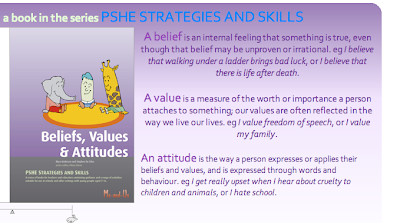
This screenshot comes from www.me-and-us.co.uk/psheskills/bva.html, a page that promotes a book that is designed to help teachers discuss with students issues about their beliefs, values and attitudes to life. Notice that the text appears to get smaller as it goes down the page. This is entirely illusion, it’s actually the same in each paragraph. Larger font size for easier reading? Weeelll, it depends.
One effective piece of research on whether people who are not necessarily all that erudite can read things in small type sizes, you can do yourself, on any day, on any bus, train or street. Look at all those folks busily texting on their mobile phones. Tiny type, but no one seems to be finding a struggle in reading it. Of course, there will be those whose physical or intellectual shortcomings preclude them from being able to use a mobile phone, including those who temporarily are unable to do so because they have left their glasses at home, but of those who are using one, it’s fair to say that they are of all sorts, including some who look to be less than high achievers.
You can experiment with different fonts in different sizes on this page by switching on the font changer which then appears in the leftmost column. Or you can look at fonts side-by-side and see how they look to you, at TypeTester though when I last looked, this sets type sizes in pixels not points. There’s sense in doing this, but of course won’t help very much to convince those people who see type sizes in the word processing software in points (a point is one 72nd of an inch (0.0353 centimeters), while a pixel is whatever size it is on your monitor, there’ll be a number of them to an inch). Fun to look at TypeTester in any case.
There are some comments on type sizes on screen at The 100% Easy-2-Read Standard. This argues for using the default font size for the browser, stating that while it might look big at first, you soon get used to it and come to love it, though it stresses that the way you make a passage of text most comfortable to read is by using an airy layout, and that the font size and type are of secondary importance.
You will find that the professionals – those who’ve given careful thought to this – consistently back this up: that the font size and type have to be looked at in context, they are not of themselves an answer to readability (repeat that final clause to yourself over and over).
A small experiment shows the big-is-better theory to be hard to support. I’m rather long-sighted, so if I take my glasses off, I can’t read the text on this screen. I can increase the size of the text. But in order to increase the text size to a point where I can read it, I have to make it so large that I still can’t read it, for though the size of the text increases, the size of the screen does not, so the number of words on a screen becomes so few that reading is unrealistic. With my glasses on, there isn’t a problem.
There is the issue of poor readers, though I have my doubts about the extent to which a poor reader reads significantly better with larger text. I’d be much more convinced by the use of simpler language.
And then there’s dyslexia. Do people who confuse letter shapes, confuse them less when the text is larger? Some people argue that certain people with dyslexia find that discernment of letters improves when the letters are made larger. I daresay it does, though does that mean they can read a passage of text easier? Depends on the volume of text I suppose.
But surely, newspaper headlines are in large type, and it’s much easier to read a headline than it is the body text, and surely poor readers find this especially so? Yes of course that’s true, and a written piece presented entirely as headlines, if it can be done, is an excellent way of communicating information concisely. It’s like they tell you, write it all as bullet points. But a whole block passage in headline text wouldn’t be easy to read at all, can you imagine it? It would be quite the contrary.

I found this paperback book quite hard to read. Not the content: that was easy, it’s very well written, rather there are so few words to a line,
and I read it in bed, I felt I spent more time turning the pages than I did reading them. It was quite disconcerting and distracting until I got used to it.
Can you imagine what it would have been like with 14pt text? That would be bonkers wouldn’t it? Oh, no, wait a minute, I could have read it faster, for those clever
people tell me I could.
You might point to something like the research indicated at http://www.unc.edu /~jkullama/ inls181/ final/font.html headed, ‘In search of the perfect font’ that says
“Research shows that larger font size increases readability, especially reading speed. Bernard, Liao, and Mills(2001) found that older adults read both serif and sans-serif fonts faster with 14 point font than with 12 point font. In a later study, Bernard and Mills(2003) found that their study participants, who were not segmented by age, preferred 12 point to 10 point font regardless of whether it was serif or sans-serif. In a later study by Bernard’s research group, the evaluators found again that the smaller the font, the slower the reading time (Bernard 2002).”
Now you can take all the research you like but that’s just nonsense. There’ll be an optimum, which will be related to the size of the page on which the text is to be found and the circumstances under which it’s being read. You can’t believe a word these researchers say, believe you me. Notice that the references don’t say how long the passages being researched were, and this is in fact highly significant. Again it’s the headline versus block of text issue. It can be a problem with research, of people applying the results of one circumstance to a much wider range of circumstances. And really they should know better.
There is the ecological question to consider too when a page might be printed, as larger type uses more ink. Studies have shown this can be quite significant.
You should also see my page about the theory behind the Guardian newspaper’s choice of font and type size. For optimum readability, 8 point on 9.5, said their research (for a newspaper, being read on a train).
One circumstance where large text makes considerably more sense than small, is in
public notices, where a message needs to be got over concisely and quickly. Akin to headlines in a way.
For readability, the type size needs to be related to the size of page on which it is located.
When you hear "font size should be a minimum of 12 point", or whatever, please
do just ponder a while. Sometimes that might be true, at other times it is quite simply dumb thinking.
Next page in this set: Letter Ambiguities, a Readability Conundrum
.


0 comments:
Post a Comment